# Layout
# Concept
The goal of the layout and design of MGT Connect can be summed up in three words: simple, intuitive, usable. For that purpose we have used established design patterns, familiar to a fair amount of users. The platform can be used from desktop and mobile devices. In the following sections, the main layout building blocks are described.
# Navigation
# Main navigation bar
The main navigation bar is positioned on the left side of the screen. For desktop devices it is always visible. For smaller screens and mobile devices, the navigation bar is hidden by default and can be toggled using a familiar button in the top left corner of the screen.
The main navigation bar contains several navigation sections

WARNING
Some sections are not available if the user has not selected a workspace
# Navigation sections
| Section | Description |
|---|---|
| Documents | All pages with sent or received documents and the create document page |
| Sending | All pages with information related to files sent to the platform or document candidates |
| Integration | All pages with information related to files sent from the platform for integration |
| Workspaces | All pages related to using workspaces and workspace specific information |
| Help and feedback | User guide page |
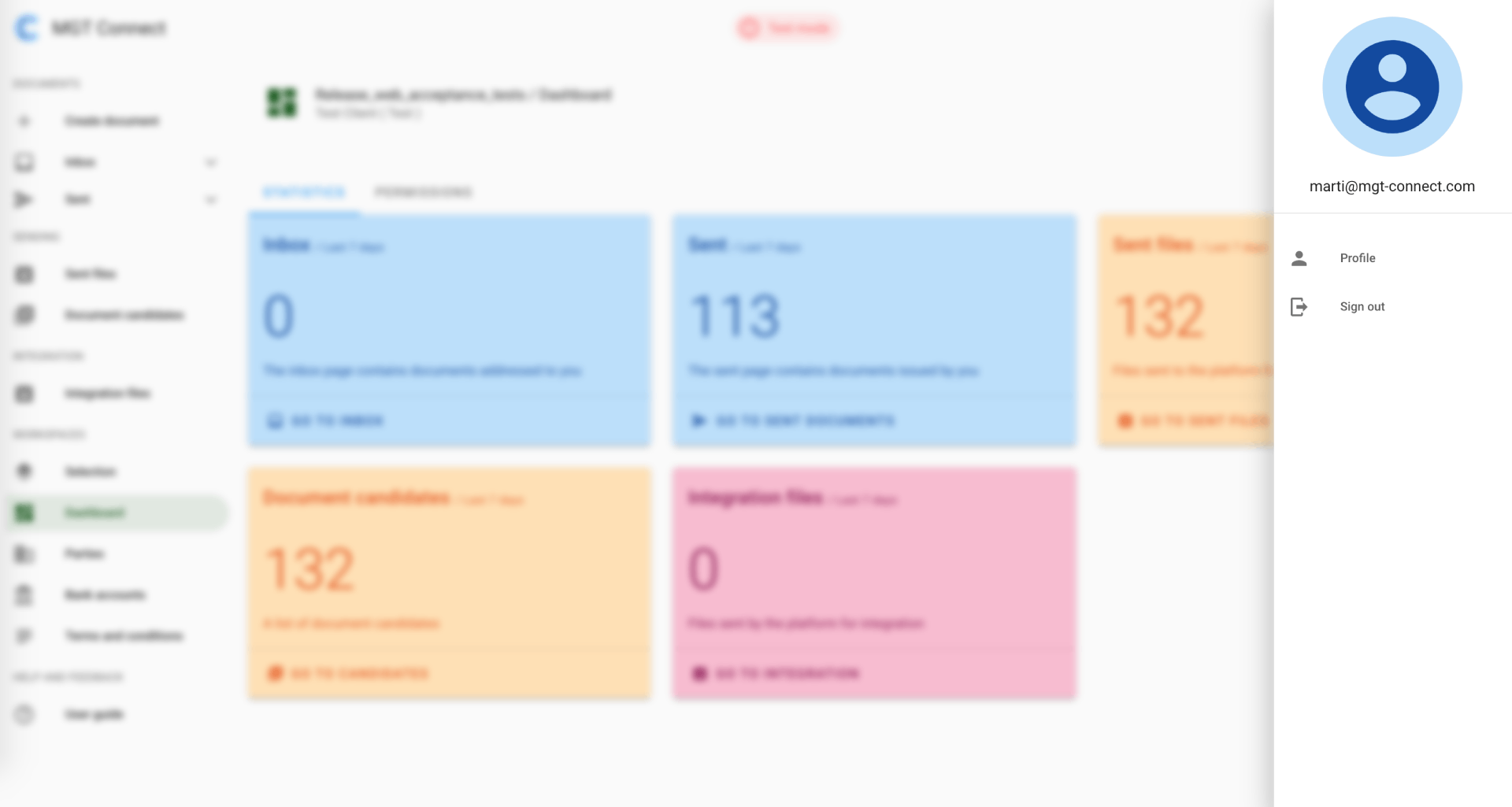
# Use profile navigation bar
The user profile navigation bar is hidden by default on all screen sizes and is toggled by the user profile button. It contains two items:
- Link to user profile page
- Sign out button
# Toolbars
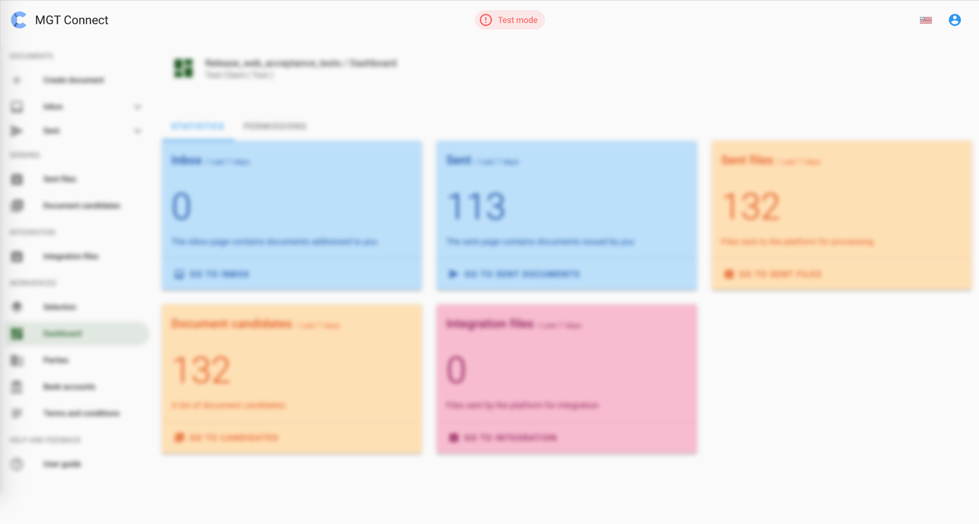
The main toolbar is positioned at the top of the screen. It contains four items:
- Logo
- Test mode indicator ( only visible in test mode )
- Language selection menu
- User profile button
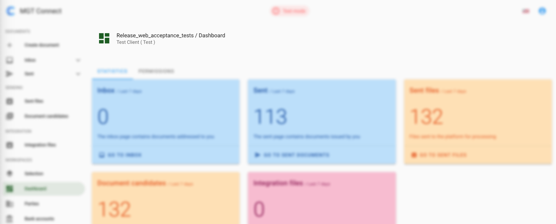
# Page headers
Page headers are positioned just below the main toolbar and contain general information for the page.
- Page title
- Other relevant information
For example the workspace dashboard header displays
- Name of the selected workspace
- Client name and acronym
# Content
There are two types of content:
| Type | Description |
|---|---|
| List views | List views usually contain a table of items, for example documents |
| Detail views | Detailed information for a single item |
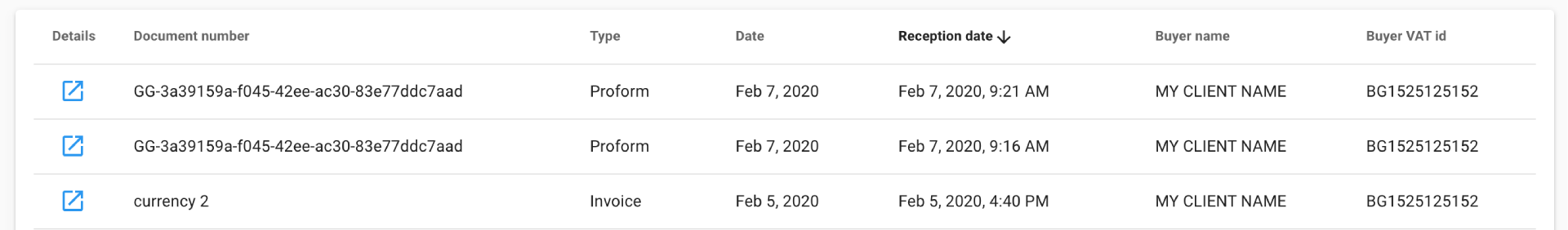
# List views
Used for listing data and contains:
| Element | Description |
|---|---|
| Filters | To search for specific items or a group of items |
| Settings | To enable / disable additional filters or columns |
| Refresh button | Refreshes information without reloading the page |
| Data table | Lists page items |
| Pagination controls | Change number of listed items ( Defaults to 15 ) and change pages |
The sent documents page is an example of list view
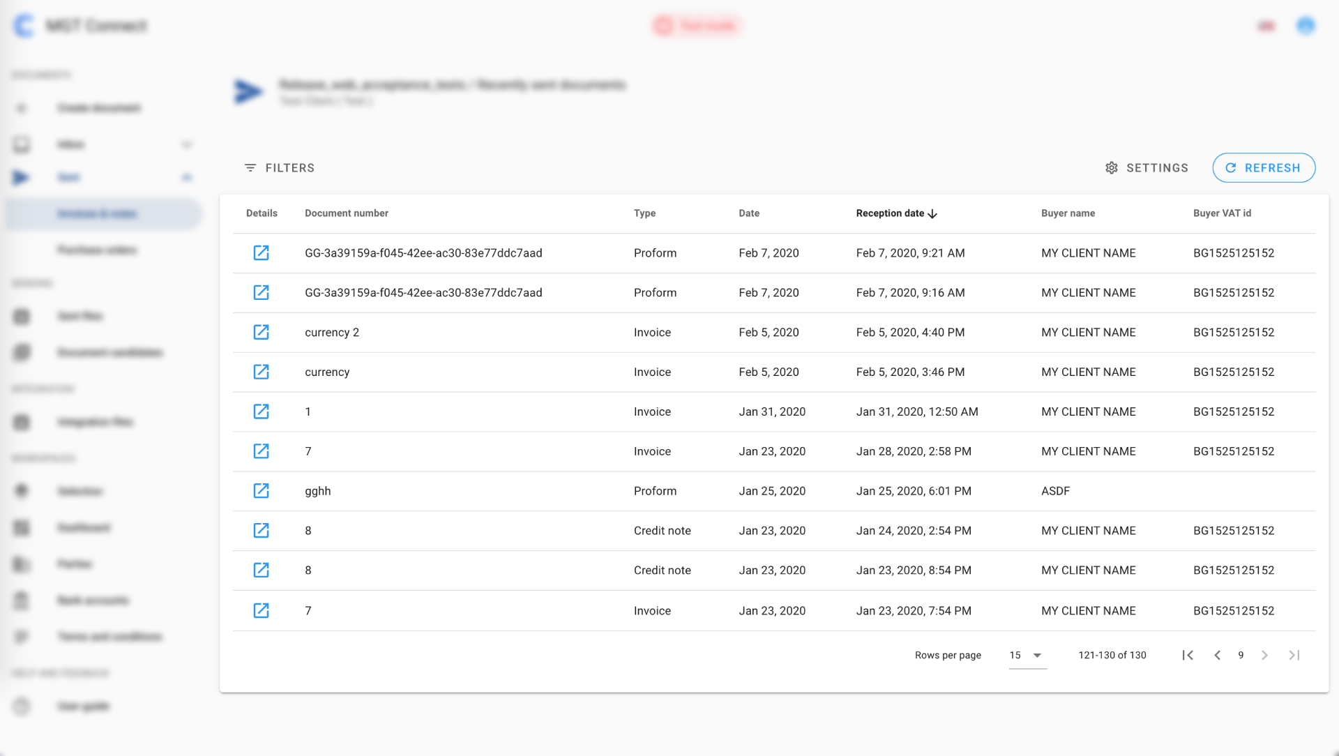
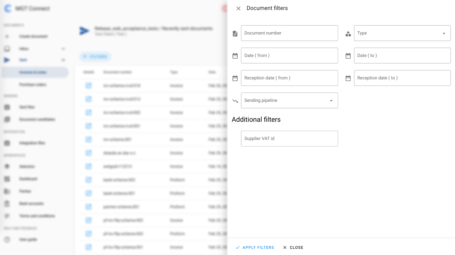
# Filters
Filters are positioned in a side panel and are hidden by default. They can be toggled by clicking on the Filters button.
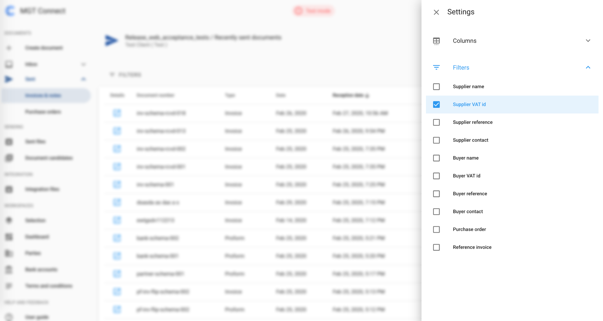
# Settings
Settings are positioned in a side panel and are hidden by default. They can be toggled by clicking on the Settings button.
# Refresh button
The refresh button is positioned just above the table, to the right. When clicked data in the table is refreshed.
# Data table
Each table contains columns relevant to the page. The first row is a header row and displays the column name.
On some pages the data can be sorted by clicking on the corresponding header cell.
The first column contains a link to the item details page.
# Pagination
The bottom of the table contains pagination controls:
- Number of rows to display
- Current page number
- Total number of pages
- Previous and next page buttons

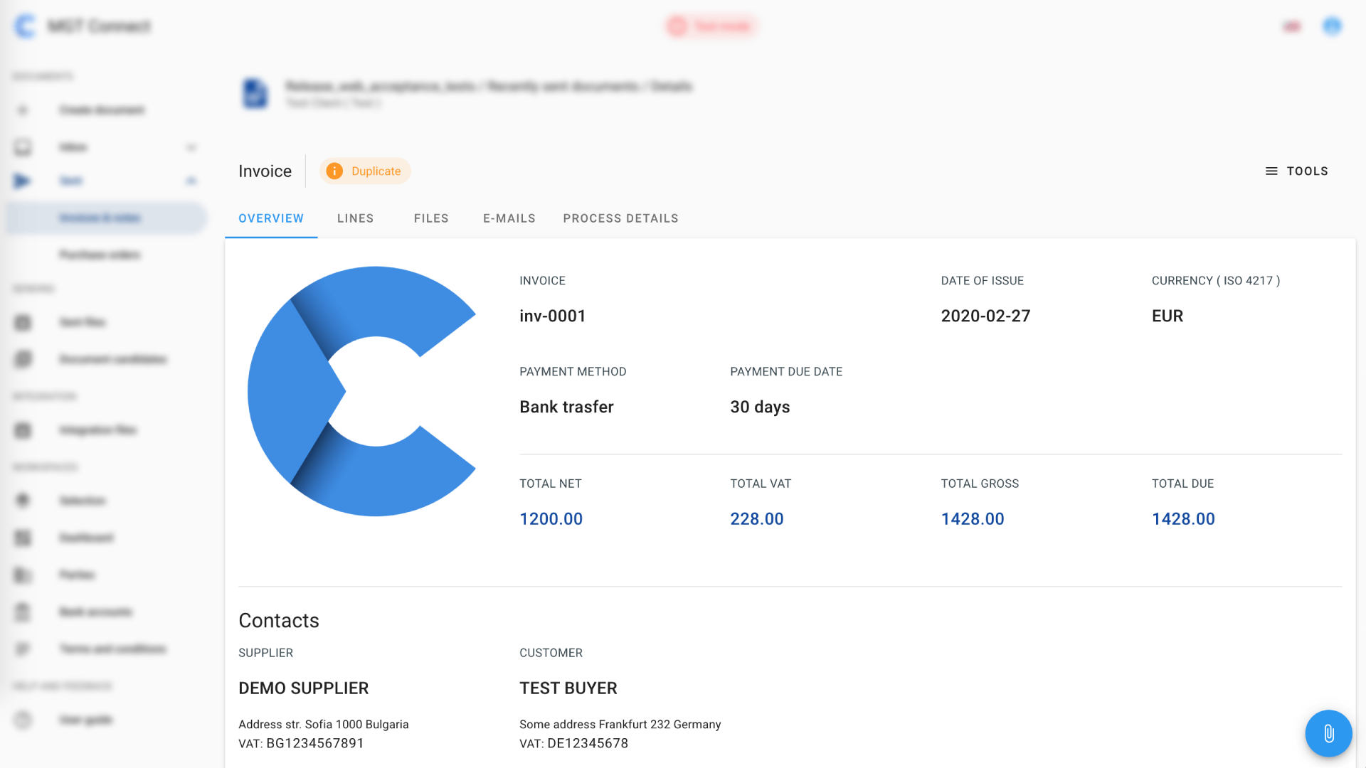
# Detail views
Detail views display information for a single data item. Each detail view is customized based on it's context. The document details page is an example of detail view.
# Action Buttons
Action buttons trigger a single action relevant to the page. The buttons are visible only on relevant pages. The attachment button on document detail page is an example of action button.
